| Clipper Street Residence - San Francisco, CA | 2007 | Residential | Completed |
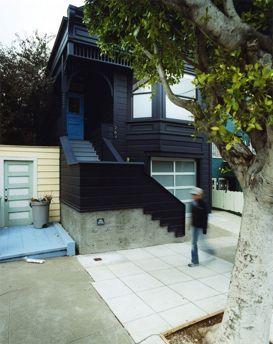
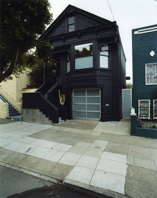
Claire Bigbie first learned about envelope a+d while dining with a friend at Delfina Pizzeria, a restaurant project of ours, which had just opened in San Francisco. She called us later that day and asked us to design her house. Claire, then a photo stylist for ReadyMade magazine, had moved to San Francisco a year earlier after working as a design assistant for Precious McBaine, the hip London interiors firm. But Claire has been attuned with design as far back as she can remember.
Growing up, Claire moved often, from Seattle to Los Angeles to Paris and back to Seattle. She remembers ritually reconfiguring the decor of her various bedrooms and finding a strong affinity to the objects in her life as they were the things that remained constant to her. As a teenager back in Seattle, she created her own skateboard clothing line and learned graphic design working in Jeff Kleinsmith's (Sub Pop Records) screen printing studio, eventually designing for Seattle’s Tooth+Nail records, all before enrolling at RISD where she earned a degree in industrial design.
Claire and her partner Jay Shapiro are both skateboard fanatics and are also engaged in rock music culture and high design worlds. Jay, an amateur skateboard photographer and former team manager for Think Skateboards, is a bassist for Space Vacation, a local heavy metal band.
In 2005, Claire and Jay purchased a tattered Victorian duplex— two stacked flats with a typical series of dark, cellular rooms—in San Francisco’s Noe Valley neighborhood. The renovation design conceives of the home as two distinct worlds sculpted to fit their uses: a surprisingly eclectic upstairs flat for living and a more matter-of-fact rendering for Claire’s lower level creative studio. In both flats, the first move was to erase the warren of partitions in the back third of the house, creating stacked live and work spaces that take advantage of the light and openness of the interior of the residential block.
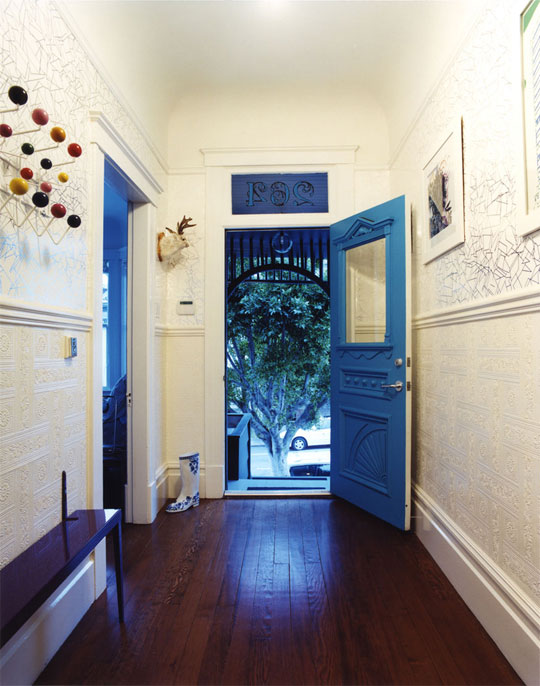
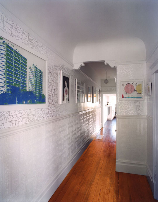
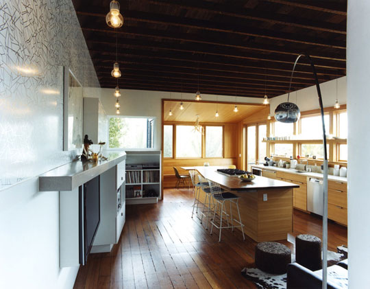
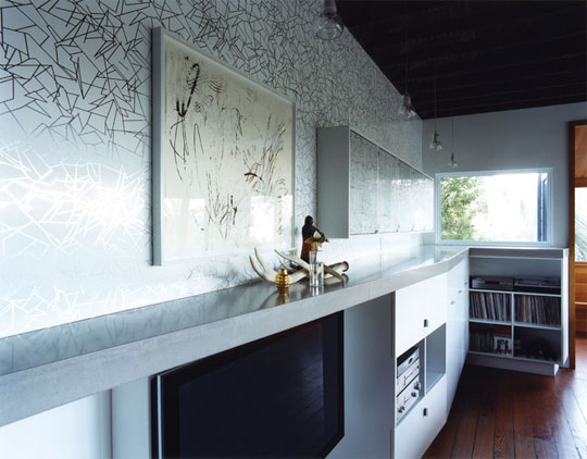
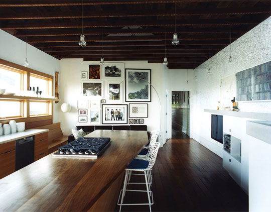
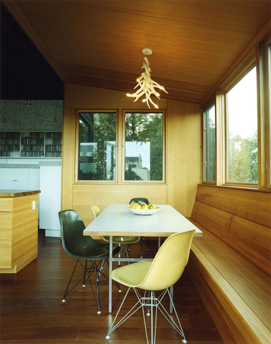
Upstairs, the newly opened space developed into kitchen/living/dining space. The floor and the ceiling were pared back to its rough surfaces, exposing the gabled roof volume with its rough-sawn collar ties and raw redwood wood boards of the underside of the roof. The original douglas fir subfloor was extensively patched and left raw. The kitchen was designed with only lower cabinetry to allow spatial continuity between the shared functions of the room. The cabinets’ hemlock veneer lowers and a large central island with a reclaimed black walnut top define the working space of the kitchen. A single long shelf cantilevers from the new window wall, replacing what typically would have been solid upper cabinets, creating an ideal display shelf for Claire’s collection of Dutch and American designer glassware and porcelain. A dining nook—articulated as a wood box clipped onto the larger gabled living space—has hemlock veneer plywood walls that warp into a comfortable bench extending across the back wall. At the other end of the room, an informal sitting area, with its lower center of gravity, is inflected in plan to allow for casual TV viewing. A tapered wall of white cabinetry draws the line of the entry / hallway wainscoting into the room, collecting the flat screen TV and housing both pantry and media. Above the line of the high gloss wainscot, Erica Wakerly reflective wallpaper extends the light at the back of the house all the way to the front door.
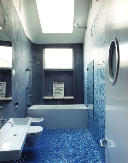
The bathroom disorients as it throws you to the bottom of a swimming pool. The room recreates one of Claire and Jay’s favorite feelings: dropping in and out of an emptied pool on skateboards. A Bisazza mosaic tile wall wraps to the floor while a white plaster warped ceiling surface is used as a towering reflecting plane. Plumbing fixtures plainly mount on the sinuous wall of gray shower stucco. Concrete pool coping creates a deep shelf for shower potions.
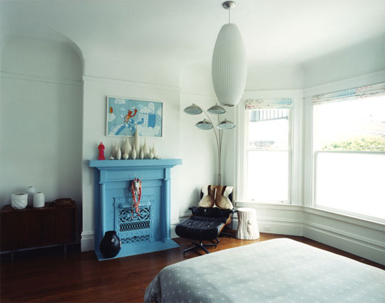
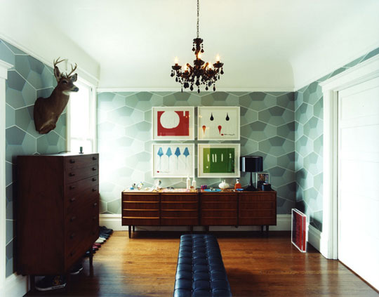
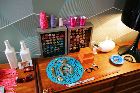
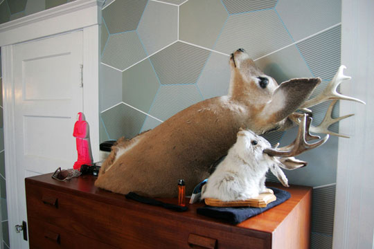
The master bedroom inhabits the former front sitting room, where a defunct fireplace is re-imagined in light cyan, crating a bright focus for the room. The adjacent dressing room is remade with geometric Cole & Son wallpaper by Tom Dixon. A snow-globe collection lives in a recessed case, locked behind glass like precious high school football trophie
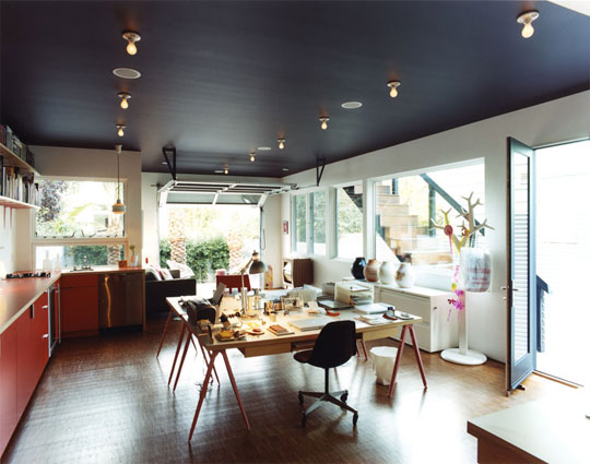
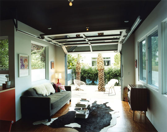
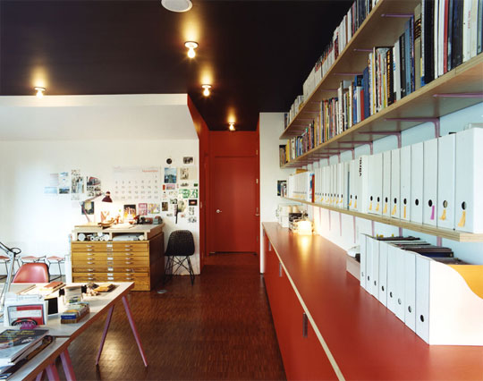
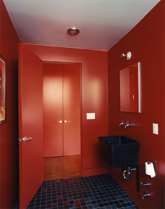
Claire’s studio is rendered plainly, but chromatically. Orange laminate cabinetry, pink powder-coated off-the-shelf shelf brackets, a deep purple ceiling and blood-red bathroom emerged from a color palate that Claire has given us within the first week of working. Worthwood end-grain plywood flooring extends through the space, lending a raw studio feel. An aluminum and glass garage door opens up the back sitting area to a rear deck and the Palm Springs-inspired garden design by Flora Grubb.
All images © Todd Hido